 RoamlineIndependent concept / September 2026
A travel companion,
at your own pace.
A native iPhone prototype that brings the day’s plan, the places worth finding and the details of getting there into one considered space.

- Format
- SwiftUI visual prototype
- Brief & direction
- Nick Calo
- Navigation
- Native iOS tabs
- Platform
- iPhone · iOS 17+
01 / Starting point
One place for the shape of a trip.
The original brief was to create five useful, visually distinct SwiftUI apps for a portfolio. Visual quality took priority over production functionality. Roamline became the travel concept: a six-day Kyoto trip, expressed through an itinerary, a field guide, a travel pocket and a journal.
The starting hypothesis was that a traveler’s plans can become scattered across saved places, reservation details and notes. Roamline explores whether those things could feel more coherent without turning the trip into a tightly managed schedule.
Audience assumptionA person planning a short city break who wants a little structure and room to wander.
02 / Information structure
Four destinations. Four different questions.
The navigation separates planning, discovery, practical details and reflection. Giving each question a consistent destination is intended to keep a traveler from searching through the whole trip for one detail.
- 01
Trip
What are we doing today?
Dates, daily stops, trip summary - 02
Places
What could we discover?
Categories, search, place details - 03
Pocket
Where are the essentials?
Flight, hotel, packing checklist - 04
Journal
What do we want to keep?
Photo keepsake, written memories
Saving a place expresses interest; adding it to a day expresses a plan. That distinction leaves room to collect possibilities before committing to a schedule. The place sheet gives both actions immediate local feedback: the bookmark changes state, and the add button shows a confirmation.
03 / Visual language
Give the trip a sense of place.
Warm paper, vermilion and serif headings borrow from a printed travel journal. Kyoto photography establishes the destination before the interface asks for an action. Fine rules and a numbered day strip organize the plan without surrounding every item in a card.
The large image and generous spacing give the opening screen atmosphere, with some itinerary content below the fold. The numbered day strip and time rail provide a consistent structure for scanning the plan.
04 / A task through the interface
From a morning plan to the details that matter.
Consider a traveler starting the day in Kyoto: check the plan, explore a possible stop, then find the hotel information. These three screens show that route through the concept.
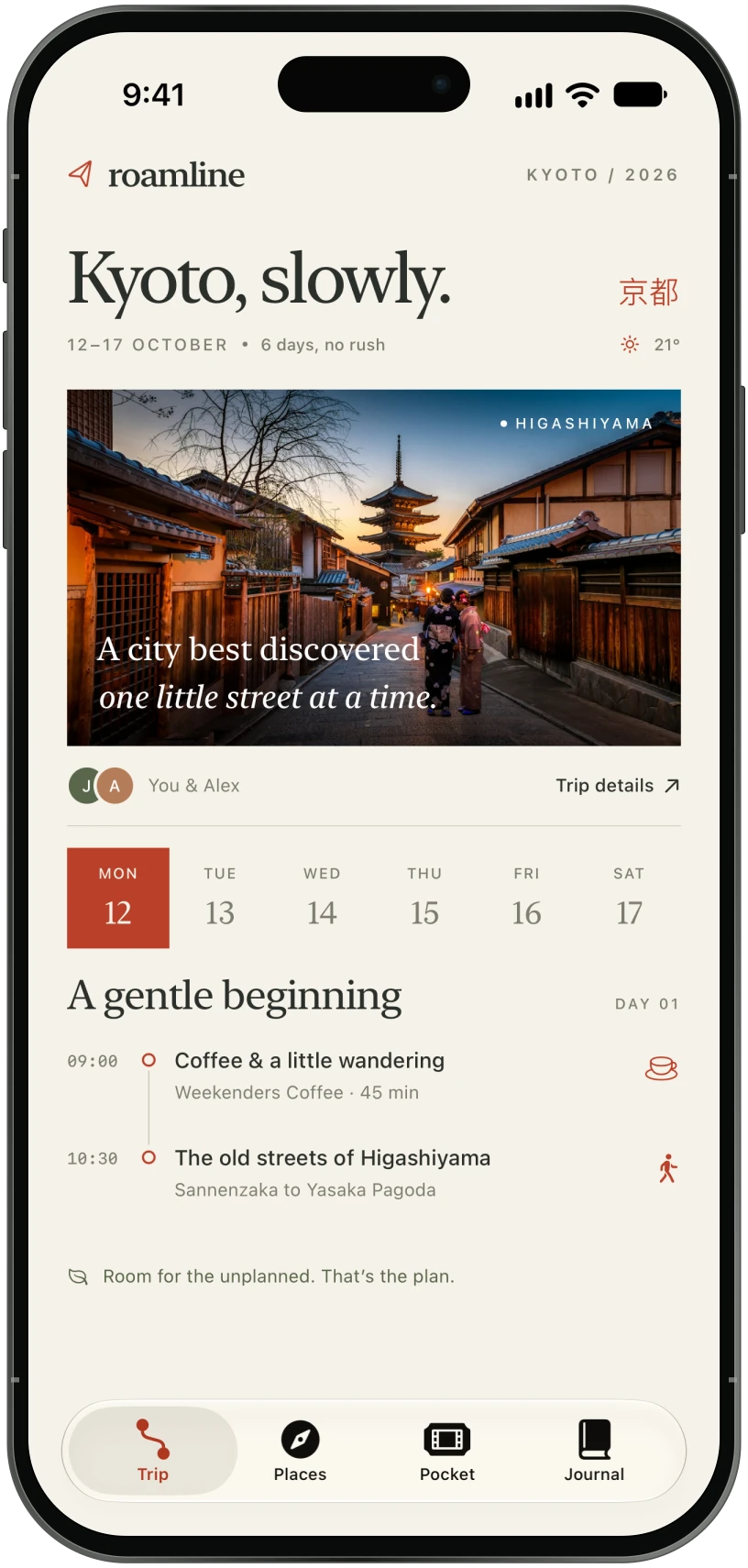
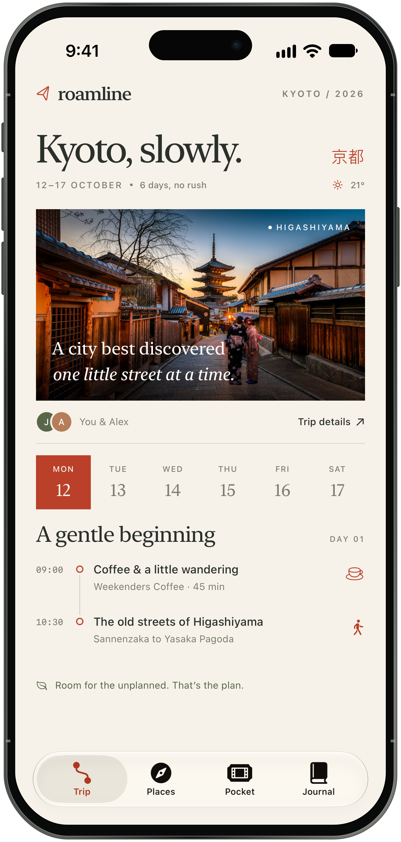
01 / Orient Find the shape of the day.
The date rail puts the six days side by side. A time rail gives the morning a sequence, and tapping a stop opens a place sheet.
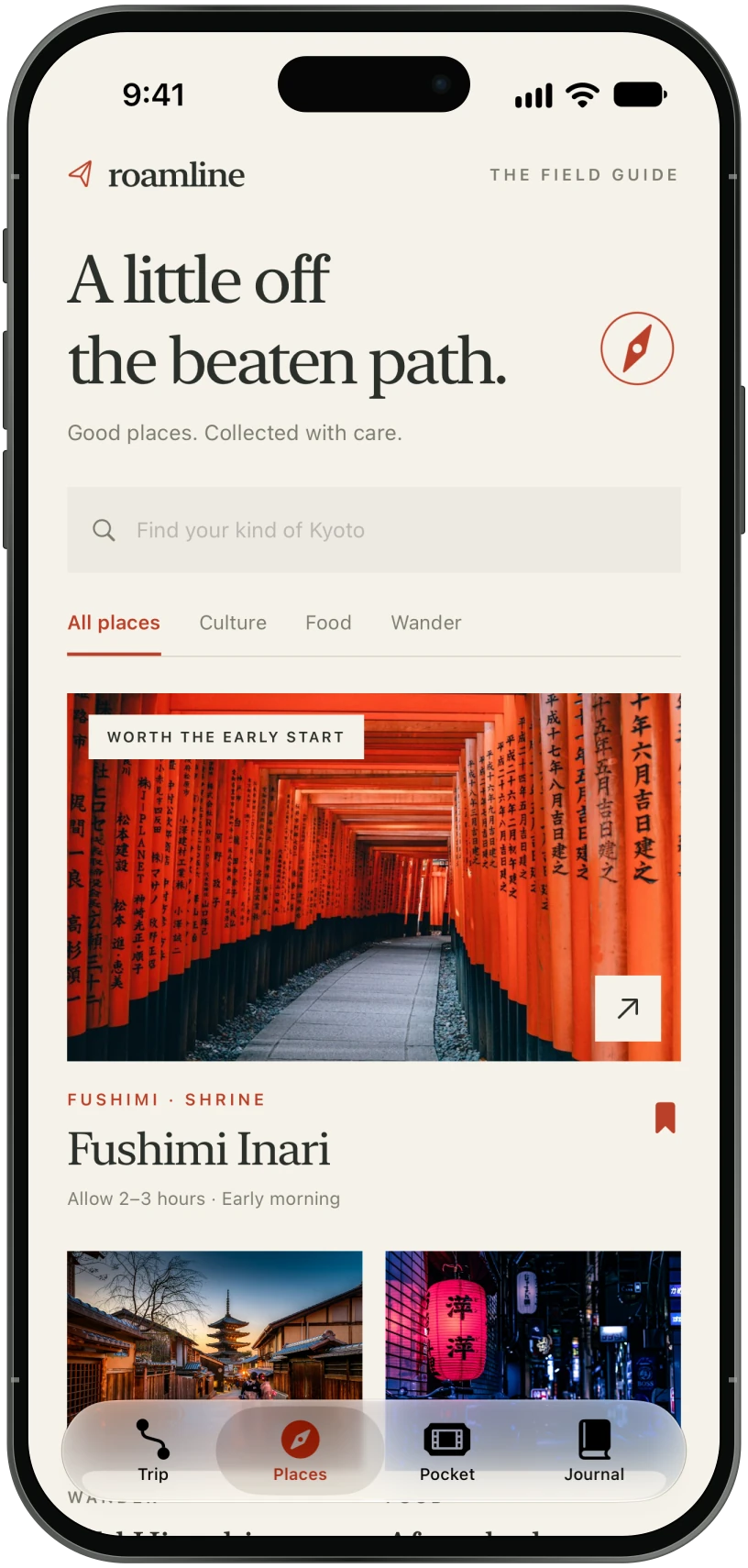
02 / Explore Make room for a detour.
Search and category filters narrow the seeded collection. Place sheets supply context and a time suggestion before showing save and add controls.
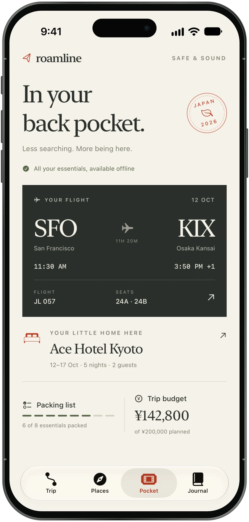
03 / Retrieve Reach the essentials.
A boarding-pass layout groups the sample flight details. Hotel information and a packing checklist have their own sheets, close at hand.
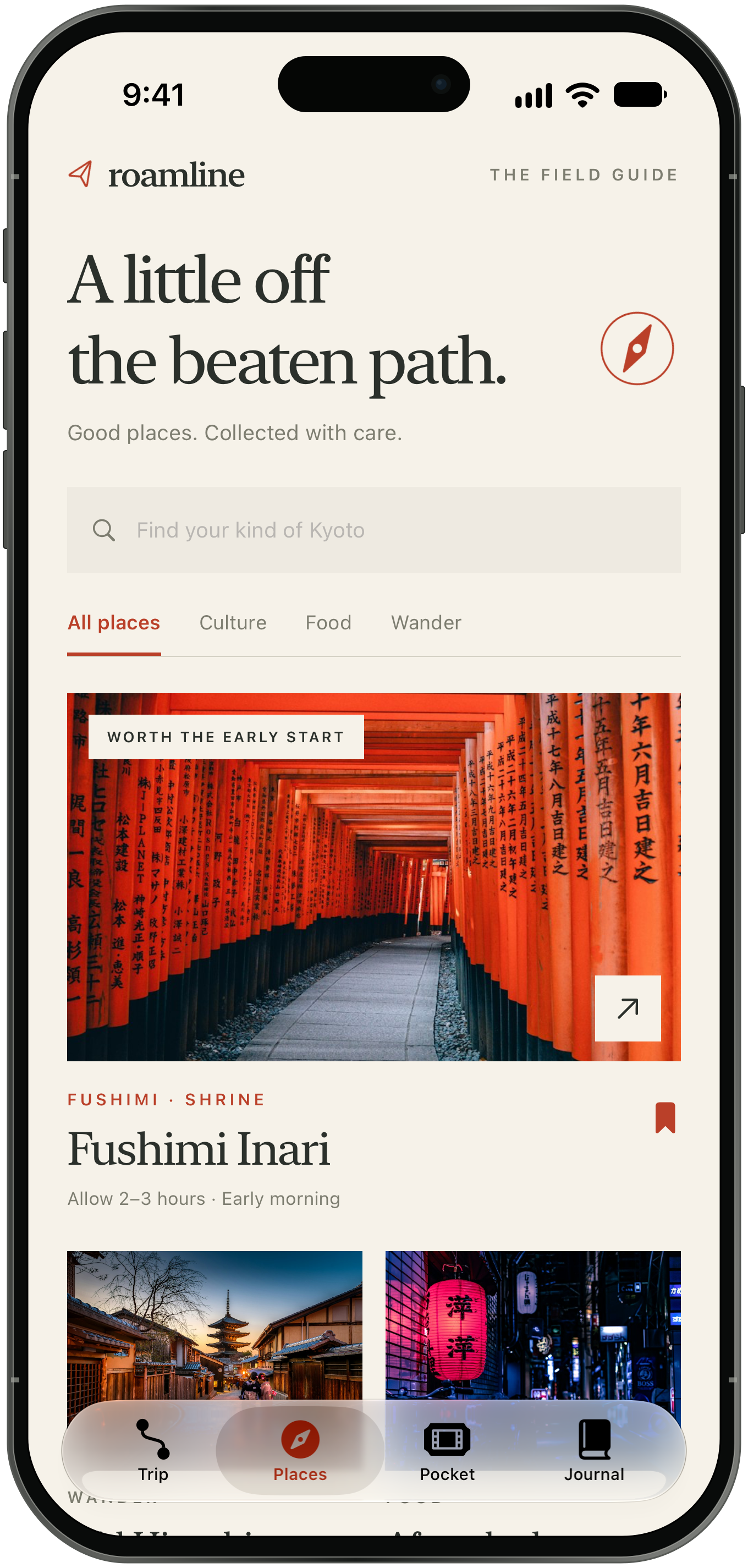
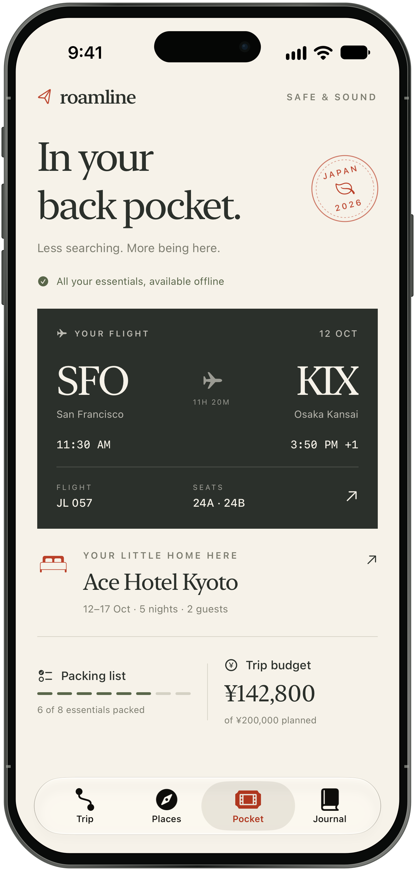
Trip, Places and Pocket connect the day’s plan with discovery and practical details.
05 / A revision that changed the build
Keep the character. Use native navigation.
The first implementation used a custom bottom row of buttons. Nick then requested native Liquid Glass navigation across all five apps. Roamline’s custom bar was replaced with a SwiftUI TabView, using native tab items and the same four destinations.
The app keeps its vermilion accent, page compositions and detail sheets. The system supplies the tab bar’s behavior and, on iOS 26 and later, its Liquid Glass appearance.
The tradeoff is less control over the bar’s geometry in exchange for platform behavior. Roamline’s identity lives in the photography, typography and content, while the navigation stays familiar to iOS.
06 / The working prototype
See the screens
in motion.
Follow a short route through the native app: choose Tuesday, explore Fushimi Inari, then open the travel pocket.
Download the recordingText description of the recording
The recording starts on Trip, where Tuesday is selected in the date rail. It switches to Places and opens the Fushimi Inari detail sheet, showing a photograph, description and suggested timing. The sheet closes, returning to Places. Finally, the recording switches to Pocket, where the sample flight and hotel details are visible.
Native app recording with player controls.
07 / Prototype scope
What the prototype supports.
The result is a working visual prototype with four populated destinations, detail sheets, search and filters, a packing checklist and a memory composer. It also includes a generated app icon and device-framed presentation assets.
- Content
- Trip dates, weather, reservations, prices and memories are examples. The bundled content and photographs open without a network connection.
- State
- Selections, bookmarks, checklist changes and notes use local view state. They are not persisted across app launches, and place actions do not yet update a shared itinerary.
- Services
- No booking integration, account system, network backend, live weather or shared itinerary sync has been built.
- Validation
- The app has been built and visually reviewed. Participant usability testing, accessibility evaluation and production reliability remain future work.
08 / Next validation — proposed, not completed
Test the questions behind the tabs.
The next step would be a small set of task-based sessions with people planning a city trip. The purpose would be to check the navigation and information hierarchy before adding services.
Find the first stop, then change the day.
Observe whether the date rail and itinerary are understood without explanation. Record task completion, time to the correct stop and backtracking.
Find the flight seats and hotel check-in.
Start on a different tab. Record the first destination chosen, retrieval time and whether the information is found without help.
Save a place or add it to a day.
Ask what each action should do and where the place should appear next. Record confusion between saving and planning, including expectations after restarting the app.
Those observations would guide changes to labels, shared state and content density. Larger text settings, contrast and touch targets would be evaluated on the native build alongside these tasks.
Photography: Unsplash — Kyoto streets, Fushimi Inari and lantern-lit street.